Korean Travel Magazine
Welcome To Korea, is a travel Magazine for those who travel for more than just the aesthetic. It’s filled with helpful tips and information that tourist needs to know before traveling.
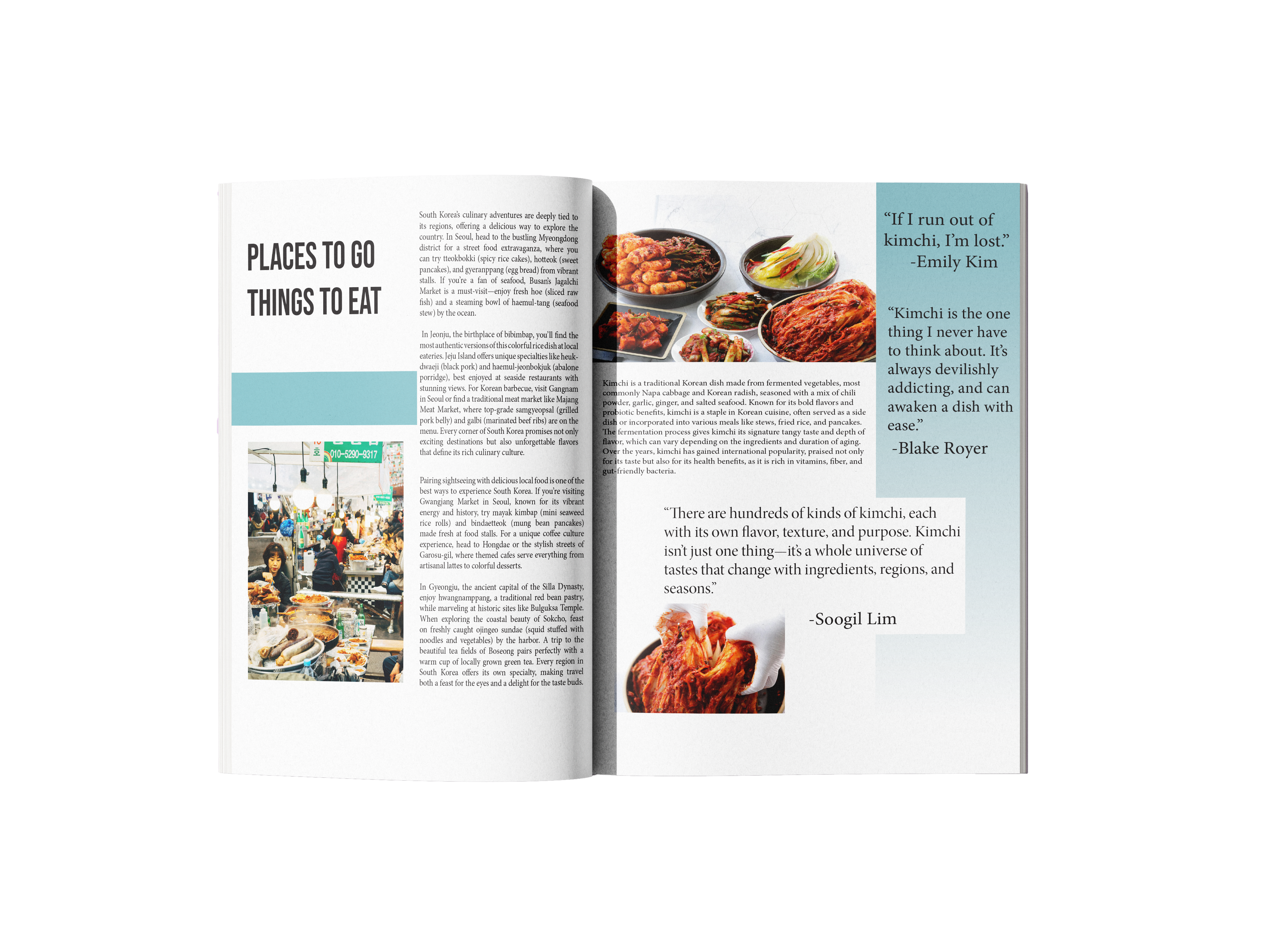
The client wanted a magazine that was not too busy, but informative. To keep my promise to the client I chose images and fonts that were welcoming positive. To make to process simple I chose the images. This made is so it was easy to fill out the body text. Even though I was tasked with using AI to create fill text. I made sure it was relevant to the images that I had chosen. Below is another page from the magazine.
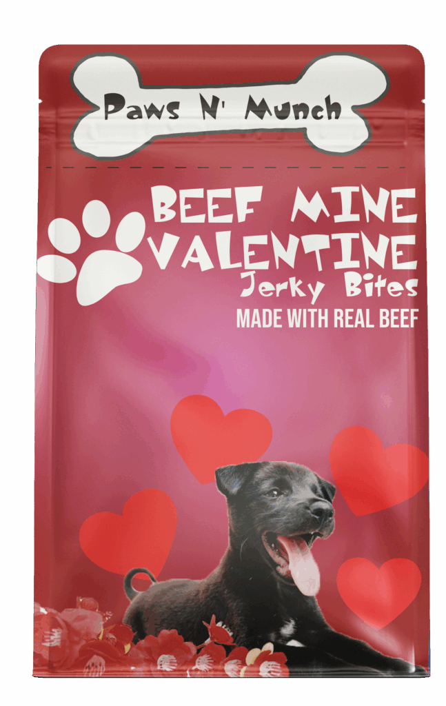
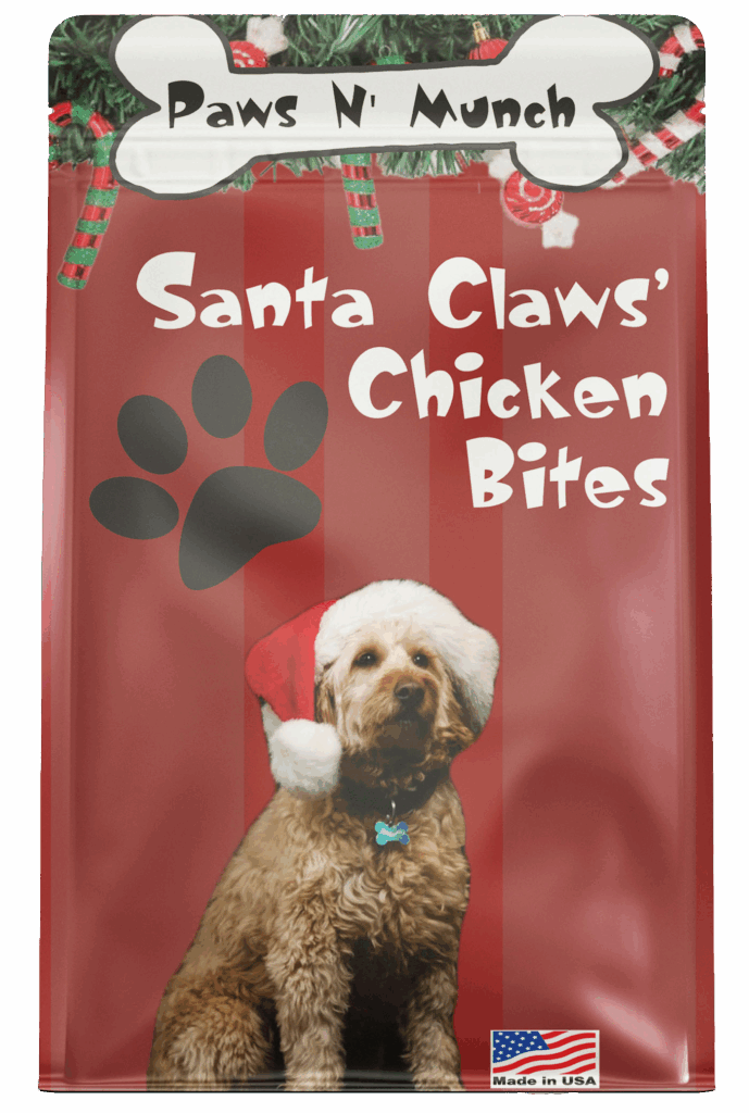
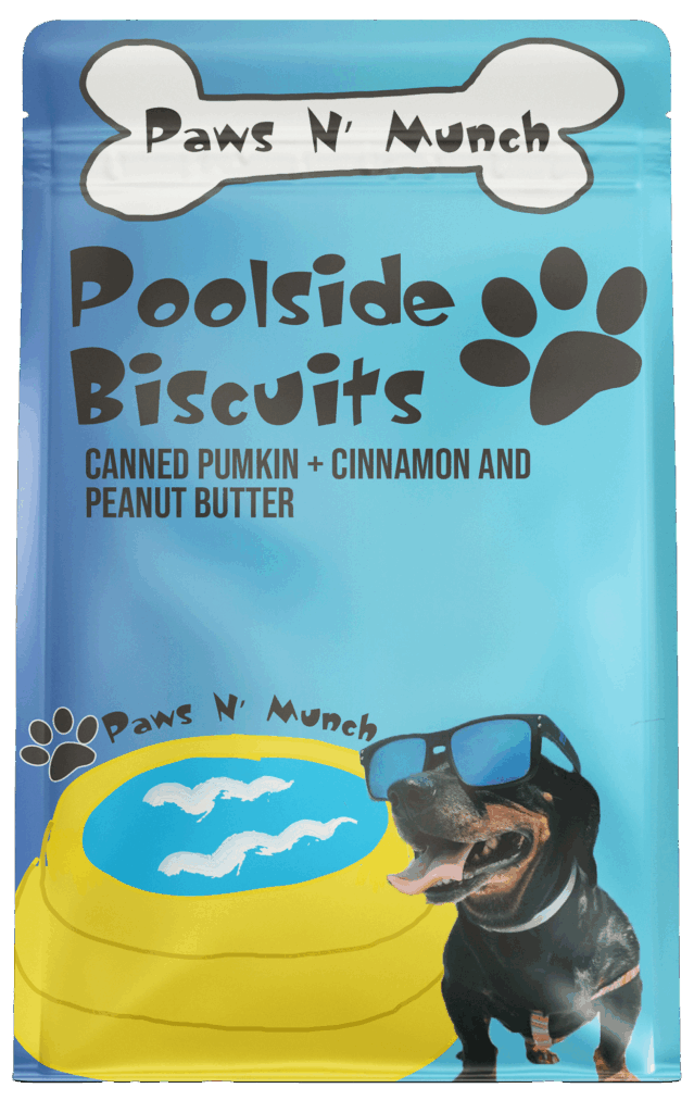
Paws N’ Munch
Paws N Munch is where tail wags meet tasty treats! Specializing in high-quality, pet-friendly snacks, Paws N’ Munch prioritizes the pets and owner’s needs.
I started this project with the summer package. When expanding this project, I knew I wanted to keep the theme of holidays, Valetines, Christmas, and Summer. I kept up with the branding by having the same fonts for all three.
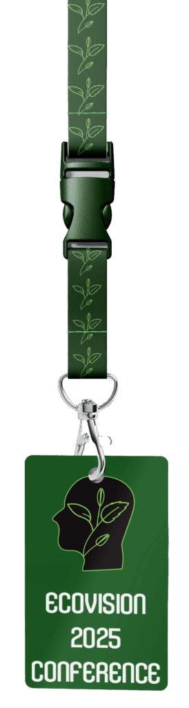
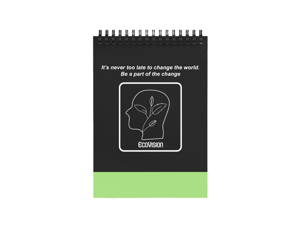
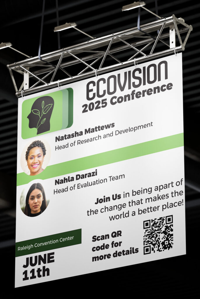
EcoVison Conference
The client requested me to create a brand identity for the 2025 EcoVision conference for sustainable and reusable energy. Along with the brand’s identity, I also created some items that would be given to the attendees of the conference, which includes a badge and a notebook! The client also requested an information banner that shows what guest will be speaking at the conference. (add more)
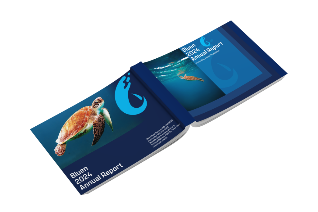
Bluen Annual Report
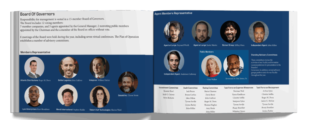
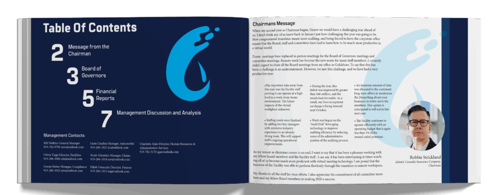
Bluen is a fictional water-focused company with a mission rooted in sustainability, innovation, and environmental stewardship. This project showcases a modern, visually cohesive annual report concept designed to reflect the clarity and flow of water—Bluen’s core inspiration. The layout includes a clean, structured table of contents, setting the tone for a professional and easy-to-navigate publication. I also designed a compelling members’ section that highlights leadership through warm, authentic imagery and minimal layouts, giving a human face to the brand’s mission.
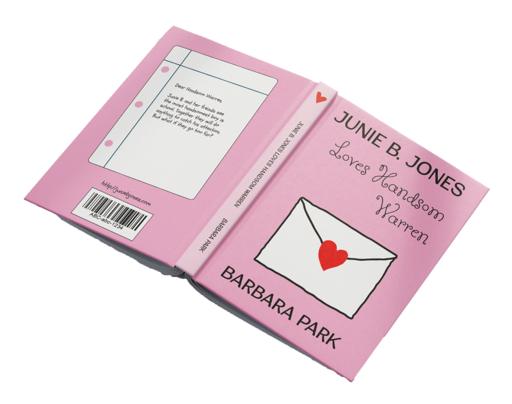
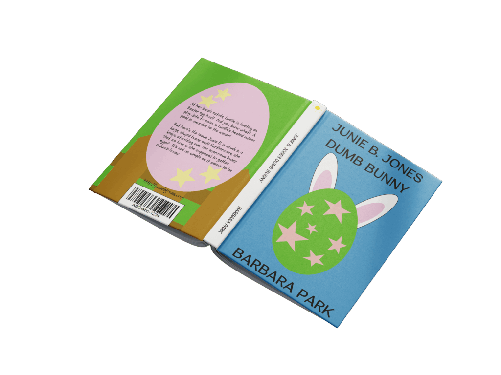
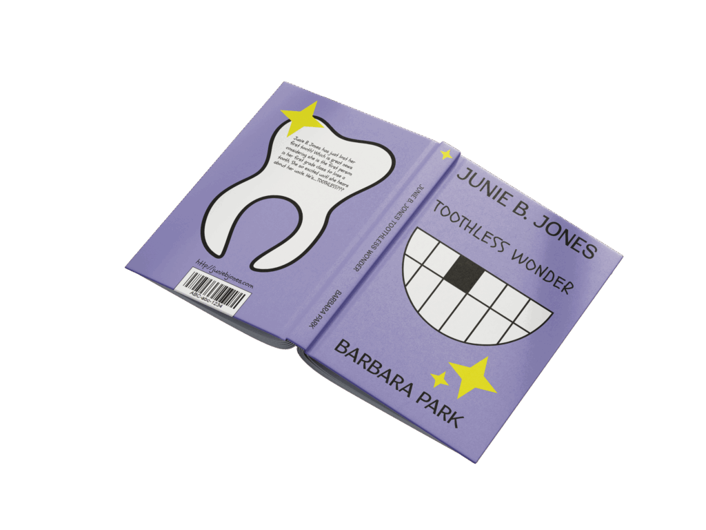
Junie B Jones
For this project, I have chosen to recreate the book covers for my favorite childhood author, Barbara Park. For each book I wanted to create covers that highlighted the literal sense of the title. While creating each cover it was important to keep in mind my target audience which is children. I realized the hardest part was creating the graphics for the front cover. However, after a little research I chose to keep it simple and not too busy.
Quick Sync
Quick Sync is an app created for busy individuals that often have multiple important appointments, meetings and dates. With quick sync you can easily sync all important dates to one app. As a busy individual myself, I find it tedious going back and forth adding each separate appointment to the calendar on my phone and or laptop, but with one simple click of a button I can sync all appointments to one place
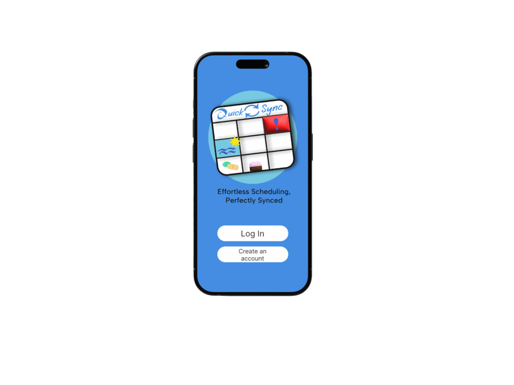
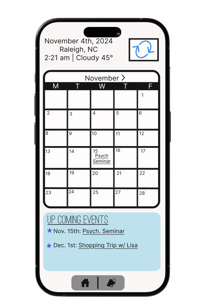
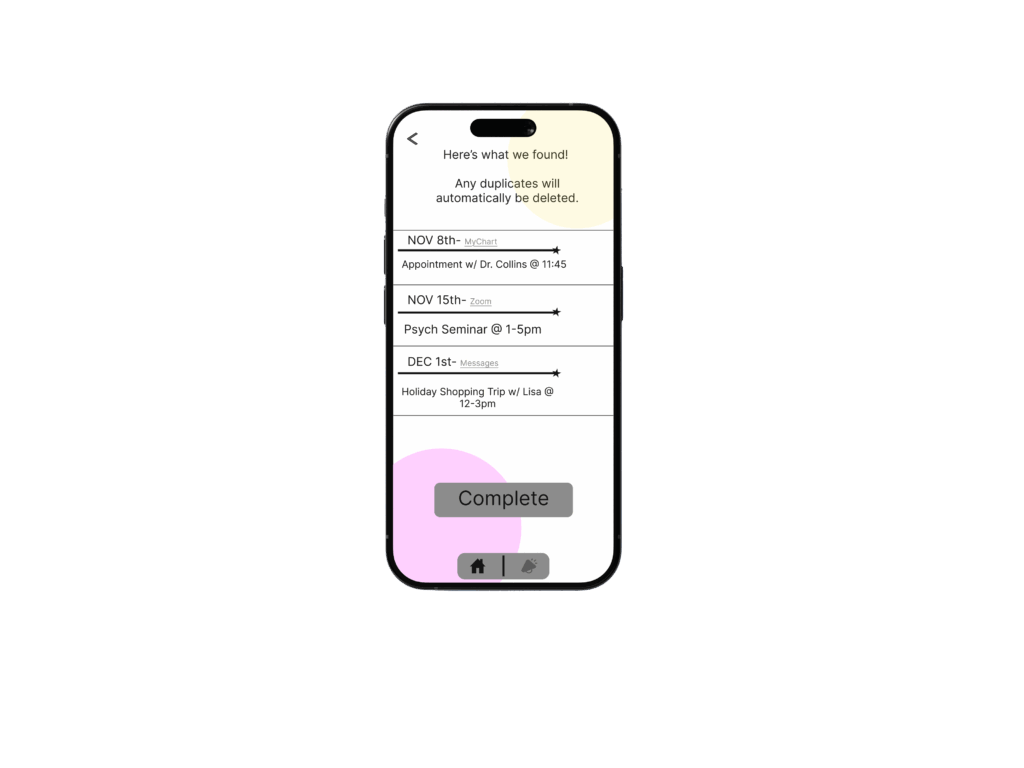
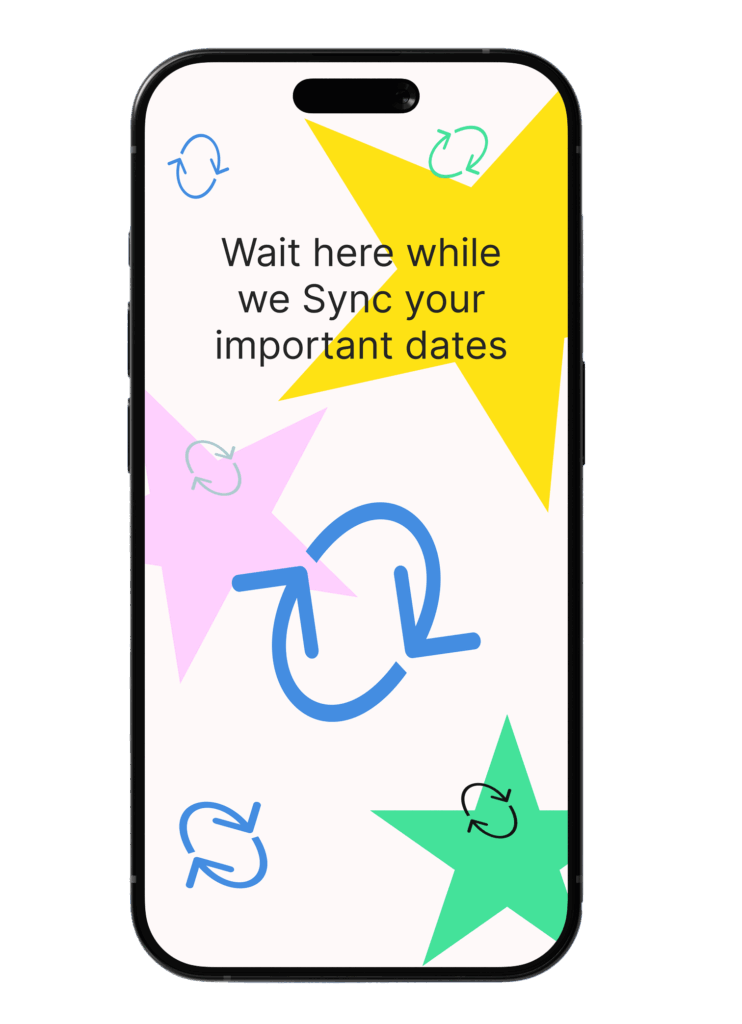
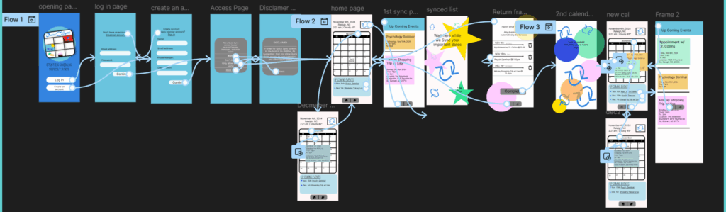
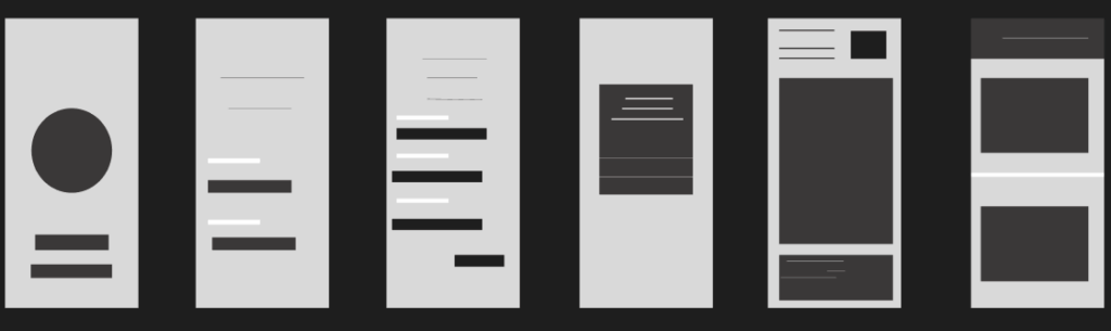
With UX and UI design I first had to make a wireframe to outline how I wanted each page, Then after adding all the details I added some navigation to make the app run smoothly. If you would like to see how Quick Syn would work, please scan the QR code with your camera!