Design portfolio
EcoVision 2025 Conference
The EcoVision Conference is about Sustainability and environmental innovation. This conference focuses on emerging technologies, practices, and policies that contribute to a sustainable future. Topics include renewable energy, green architecture, and sustainable business practices.
Starting with…….
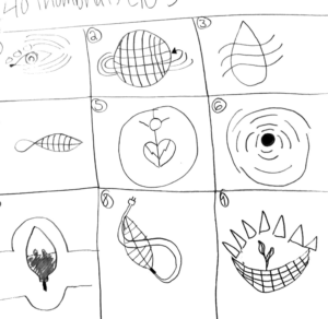
Brainstorming and Sketching
Before starting the sketching process, I took the time to research my competition and understanding the clients wants and needs. When beginning this projects logo, I knew that I wanted to create one that involved the earth or a leaf.
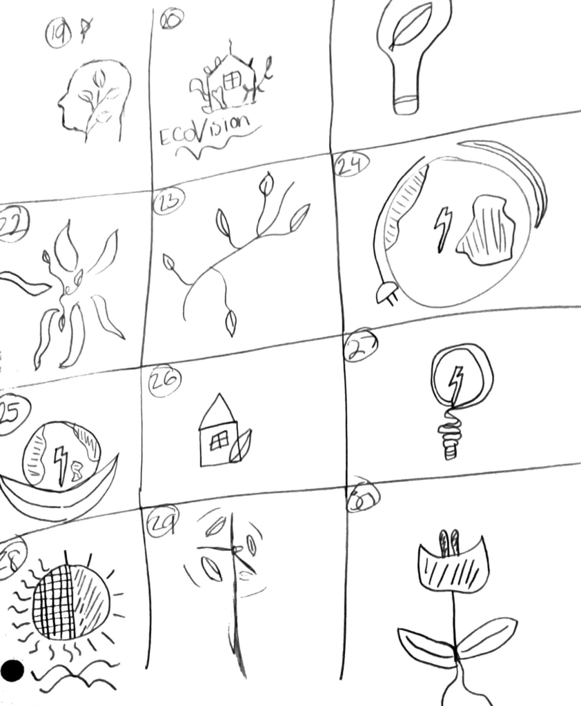
The final logo happens to be a lot like number 19. I chose this logo because the leaf’s represent natural energy and the head would represent Innovation, Consciousness, and add Human Element that helps shape the world for a greener future.
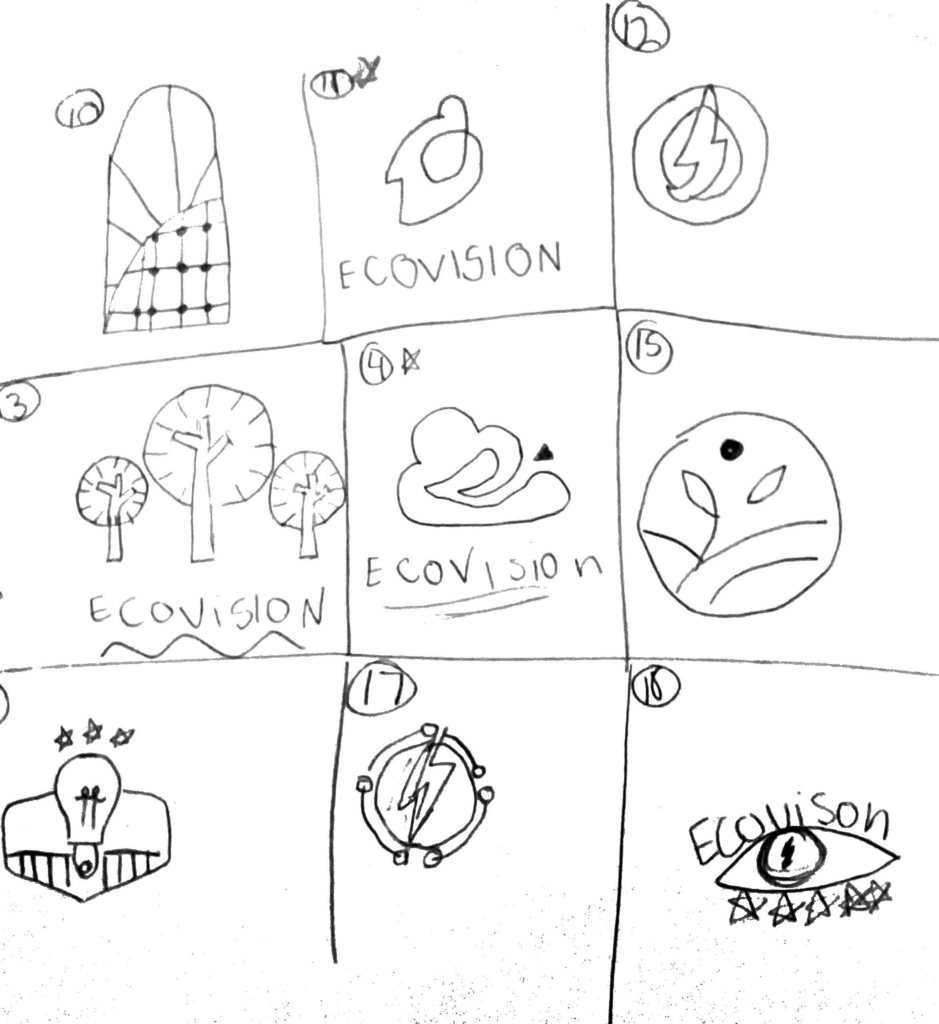
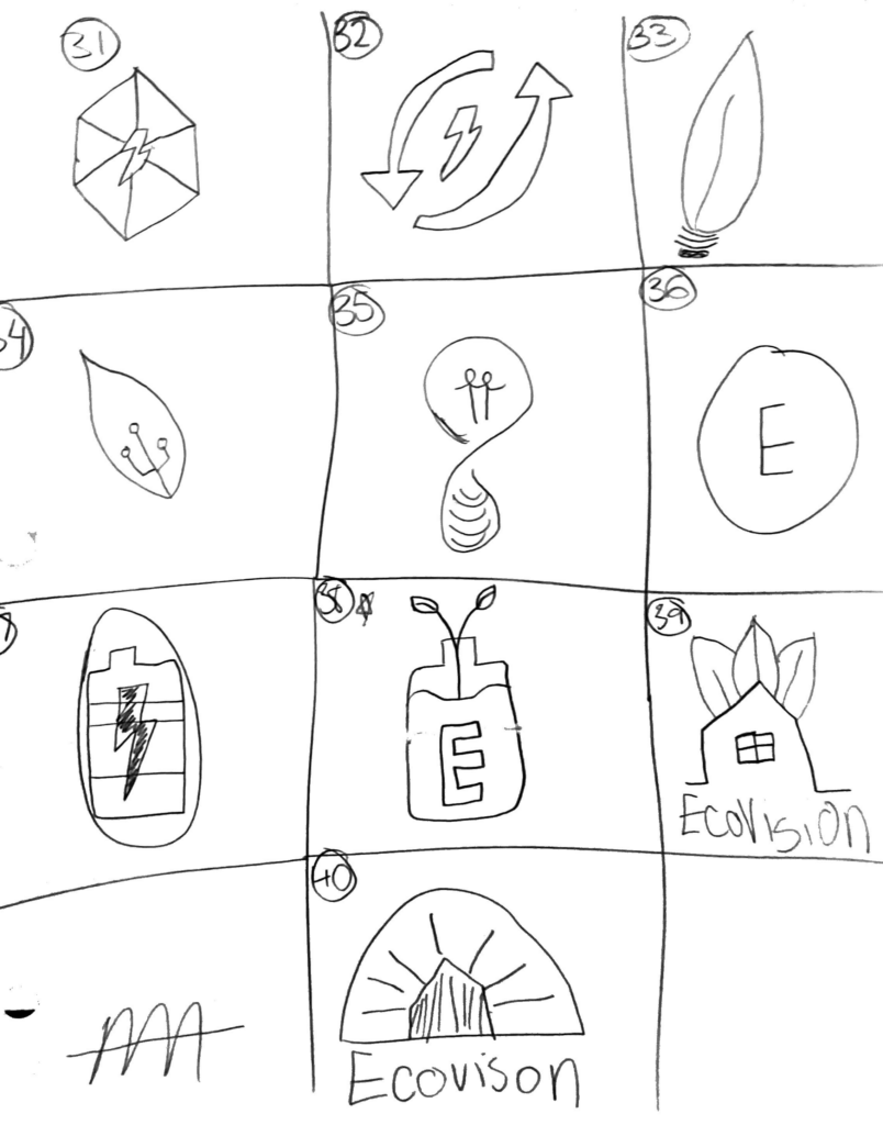
Then transitioning to….
Digital Roughs
The Head with Leaves: This concept stood out as a powerful symbol of conscious innovation. The head represents thoughtful decision-making and human-centric design, while the leaves growing within suggest sustainable energy and eco-awareness blooming from within.
The Abstract Leaf Swirl: This logo leans into a more fluid, organic form. Its soft curves and light tone reflect harmony with nature and motion—symbolizing how sustainable energy is both gentle and powerful.
The Bold Green Mark (EcoVision): This concept merges a leaf-like shape with a dynamic, almost tech-inspired design. It felt like a great balance between natural energy and forward-thinking innovation, which aligns perfectly with the name “EcoVision.”
Its All coming together with….
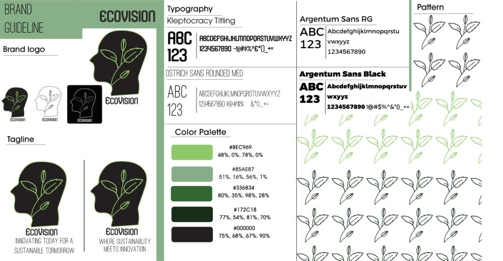
Fonts and Color Charts
Once the final logo for EcoVision was selected, I expanded the brand into a full visual identity system. The next step was creating a comprehensive brand guideline—a tool to ensure consistent and intentional application of the brand across all platforms.
Typography Selection
I chose a clean, modern mix of typefaces—Kleptocracy Titling for its distinctiveness and futuristic feel, and Argentum Sans for readability and versatility. This pairing reinforces the brand’s blend of innovation and approachability.
Color Palette Development
The palette is rooted in earthy greens and soft blacks, symbolizing growth, balance, and sustainability. The variety in tones—from muted sage to deep forest—gives the brand flexibility while maintaining a unified look.
Pattern Design
Using the leaf motif from the logo, I developed a seamless pattern that can be applied to packaging, digital backgrounds, or printed collateral. It visually ties the brand together and adds a unique, ownable texture.
advertisments strategies
Preliminary and Final Posters and Ads
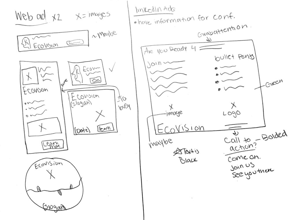
Web Ad: I sketched out a few vertical and horizontal ad formats, experimenting with placement of key elements like the logo, slogan, call-to-action, and supportive imagery. These layouts explored visual balance and readability at a glance, which is essential for digital ads.
LinkedIn Ad: This concept included room for an attention-grabbing headline, a supporting image, bullet points to convey important info quickly, and a bold call-to-action (e.g., “Join Us” or “See You There”). The layout was guided by user behavior—short attention spans, mobile viewing, and the need for scanning.
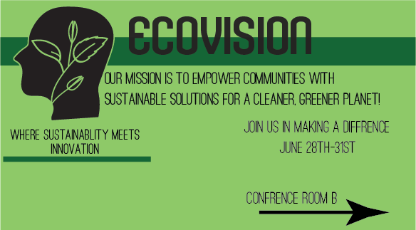
This is my first go at a LinkedIn Ad. I tried to make it look “cool” by adding an over lay of the company name and the green stirp. This design ended up not working because the text clashes together and it’s not unified or balanced at all.
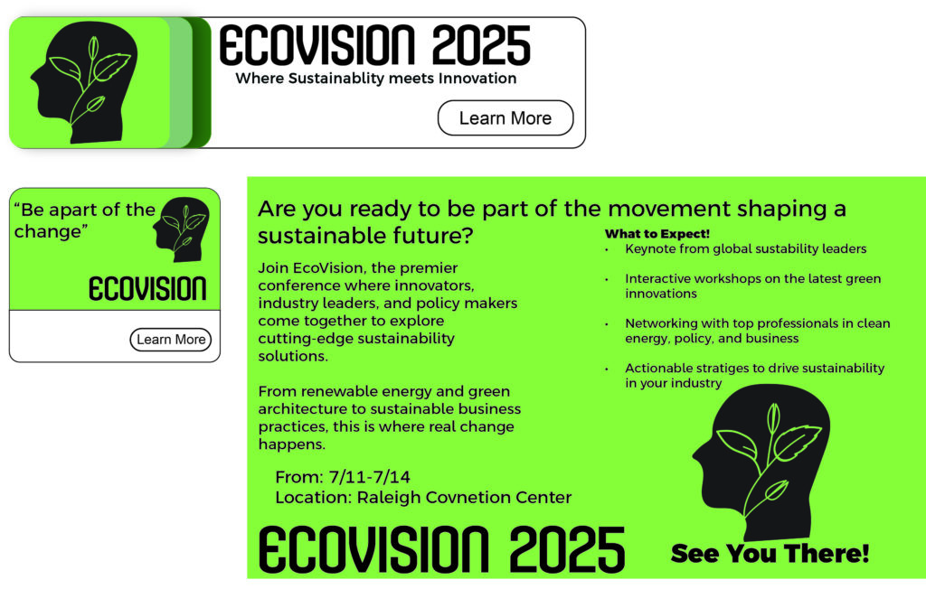
Both ads seen on the left are ads that would be found on websites that have a connection with renewable and sustainable energy. The LinkedIn ad on the right ended up being just how I wanted it. In the future, I would compress some of the text so it’s easy to read for those who scroll.
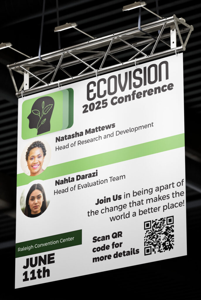
This is banner #1. when producing this banner for the conference, I knew I wanted to have two speakers that were posted with their headshot and their titles. The diffrent shades of green is there for design and the QR code was created to help attendees get more details while at the conference.
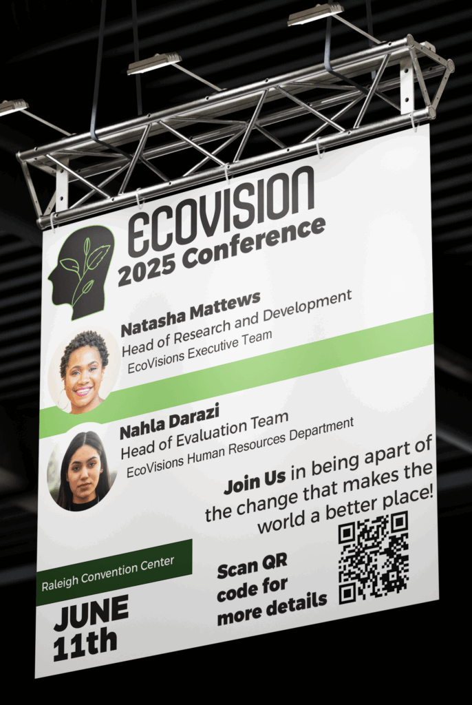
This is the updated banner of the one seen above. After receiving feedback, I noticed that the different shades of green did not do much to portray the banner. While having the speakers’ titles, I also had to add who they worked for.
Finishing the project with……
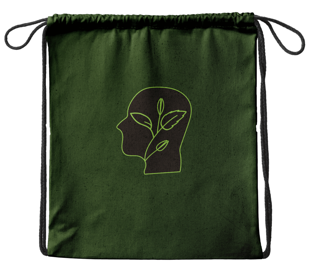
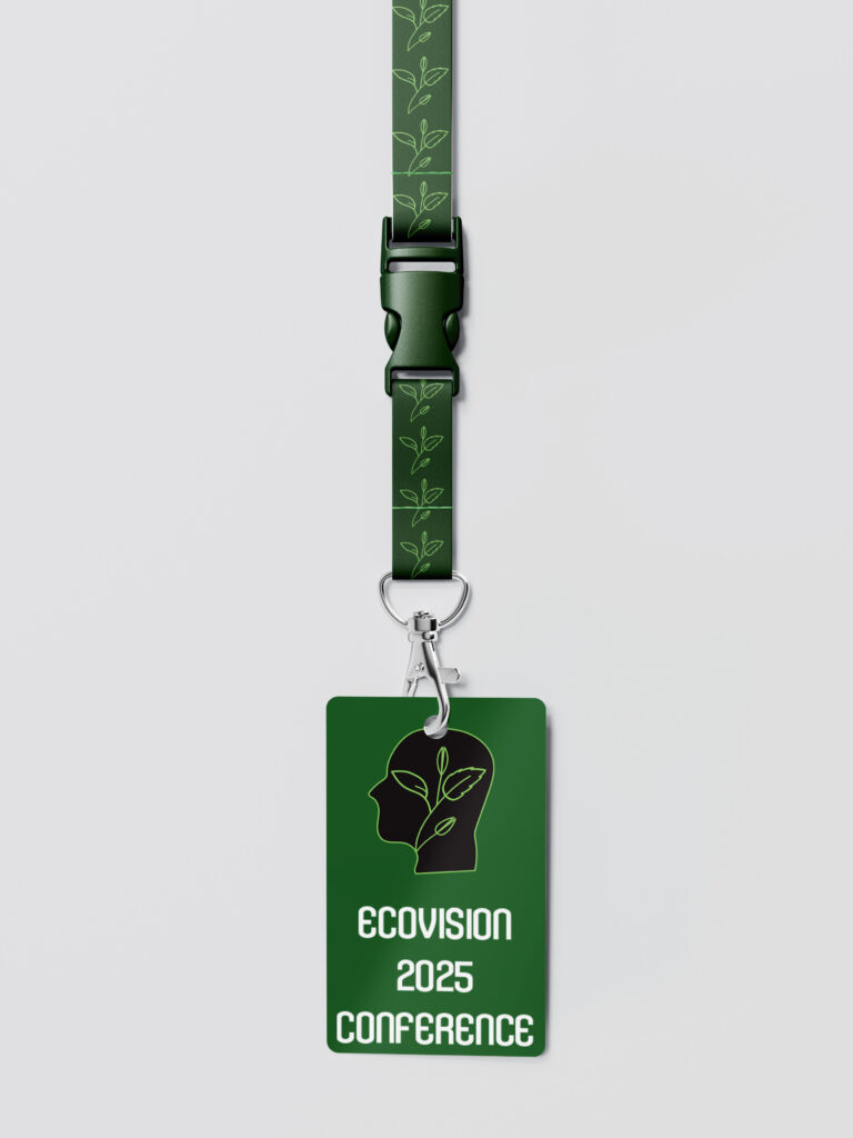
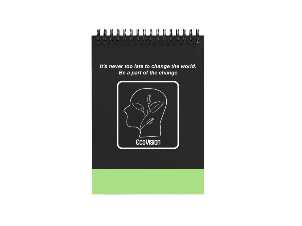
A touch of Swag
To finish up this project the last thing I was required to design is the swag. The notebook, bag, and badge are items that will be given to the attendees for the conference. While creating the swag I did not want it to come off as too busy, so I decided against adding the pattern to the others. The bag for this conference would be made out of reusable materials as will the badge and the notebook (recycled plastic and paper).